For Tracy Michele, who always sees them first.
"I wish you to consider that I have been speaking of what I wished to accomplish in these pictures, rather than what I have done; for I may have failed in these efforts. I should, nevertheless, be much gratified if you could see them ...."
- Thomas Cole, letter dated May 1828

Friday, December 31, 2010

these days


"These days I seem to think a lot
About the things that I forgot to do
And all the times I had the chance to"
- Johnny Darrell, These Days

The end of the year always makes one look back and take a measure of what was accomplaished and what wasn't. 2010 was a mixed year for my work. There were duds and missed deadlines --- Ordinary Objects is still not realized, and the portfolio remains unassembled.

On the other hand, there were positive developments --- the Bullock Online website was established, my Iron Gall Ink is now retailing at Lore (see my previous post), and some of my work this year was solid.

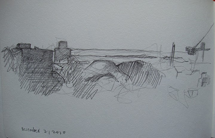
So I sat down and looked out the window again at the landscape view that has occupied much of my time lately and I did one more watercolor. Also, here's a recent sketch of a wider take of the same view, from my sketchbook.

I guess that's how I'll close out the year.

Hoping you all are safe and healthy in 2011.

Happy New Year, everyone.

Friday, December 24, 2010

Bullock's Iron Gall Ink


Bullock's Iron Gall Ink is now available at Lore, in the The New Amsterdam Market HEADQUARTERS at Manhattan's South Street Seaport, 224 Front Street.

This handmade water-soluble ink is based on historic recipes, and includes gall nuts from Aleppo and iron sulfate in a gum arabic base. It is available in 1/2 oz., 1 oz., and 2 oz. bottles.

At Lore, owner Makalé Faber-Cullen's background and education in anthropology informs her selection of products that are based on raw materials and timeless design. From equipment for the kitchen, to sewing supplies from France's last producer of hand-made thread, to Bullock's Iron Gall Ink and Margaret Krug's Indigo Ink, Lore offers a very unique and educational shopping experience for the customer who wants something better than what's available at Bed Bath & Beyond.

You can also reach Lore online at www.lore.is
Lore. tools. ornaments. provisions.

My thanks to Makalé and Margaret for their enthusiasm for Bullock's Iron Gall Ink.

Graphic Design for all Bullock Online packaging is provided by James Rollins Design of Brooklyn, NY. www.creativehotlist.com/jrollins

On a related note, the Bullock Online website is oh so slowly coming along. I just added a page for the ink, and will link to PayPal. All this shouldn't be such trial and error, but the hosting service I use is problematic. Nonetheless, I am learning to navigate the strange ways of their software. I often end up with results I don't want, but I make improvements the next time round.

Now, if I can only find the time to paint.

Merry Christmas, everyone.

Tuesday, November 23, 2010

more greys


"Greys are what might be called 'diminished' colours that are less brilliant than pure colours. Greys, nevertheless, are an essential element in painting since there are in nature more greys than pure colours."
- J.Martin-Barbaz, The Holiday Painter, 1961

After extolling the virtues of the limited palette, I went and added four more colors --- two blues, a chrome oxide green, and sepia. The need to add these became apparent to me as I continued to work on a small scale, and the "next" version of a piece, wherein I develop those initial ideas discovered in the smaller study, weren't getting done. I'm short on time and space and so the little "studies" are becoming an end in themselves. For now.

Chrome oxide green has always been a favorite of mine. The sepia is an historically accurate addition and its transparency is helpful in mixtures. As for the addition of two blues, ultramarine and cerulean, when I already have prussian, I'll just say that the various grays they provide are important. By mixing only with sepia, for example, I have three different cool grays. The results are shown above.

Saturday, October 30, 2010

a thousand different aspects


"To many people a place is merely a place. It may be viewed under a thousand different aspects, but it is seen only as the same place. And yet, if we inquire into the psychology ...... we find, not an inherent sense of realism, but a quintessential sense of symbolism." - J.Hullah Brown, Water Colour Guidance

For reasons that at first were not apparent, the view from the Brooklyn Heights apartment, facing south-west (more or less), really interests me. Throughout the day there is a dramatic range of color, illumination, and shadow, all played out upon groupings of architectural forms, masses of trees, and distant points, which is really kind of fascinating to watch. The hills over in Jersey are sharp-edged and solid sometimes, misty and ethereal other times. The buildings, with just a little imagining, could be Roman ruins. But why imagine? It's all really splendid as it is.

I want to keep working on this same view, seeing how it gives me so much to work with. It changes all day long, so there's always something new going on. And I don't have to go somewhere to do it. It's right outside the window. And the tea pot is only a few feet away.

Tuesday, September 28, 2010

'accuracy' is relative


"But the accuracy of artists working as artists is the expression of feeling with precision. For them, 'accuracy' is relative, and 'realism' is only a wish to be objective, because there can be no general agreement in the arts as to what is real: each artist has a different way of explaining it."
- Lynton Lamb, Preparation For Painting

This is as close as I've come to identifying with abstract concerns. But it becomes obvious to any working artist --- painter, sculptor, whatever you like --- that even representational art is a form of abstraction unless we enslave our talents to pure surface copying. The simple act of interpretation into paint is a step into the abstract. This watercolor was done recently of a view out of Tracy's window overlooking the BQE with Red Hook to the southwest. Eliminating the smaller elements in the scene, I got down the larger, most important elements to create a balance without oversimplifying.

Tuesday, August 24, 2010

Bullock Online Website Update

The link to the right will take you to my website, Bullock Online, which is up and running again. This is an ongoing project, but I expect the general layout will be completed by October, with a full-service sales feature so my work is available for purchase. In the meantime, this blog is still the best place to see my work.

The web site's host and their design-your-own-website software has been less than inspiring, I'm afraid, but I am looking at alternatives and am confident that something great will work out soon. The ability to design one's own website without knowing HTML code is quickly becoming a commonplace feature, and offers increasingly sophisticated results. In the meantime, there are a few frustrations that I am just stomping my way through. No direction to go but forward, right?

In A Shot In the Dark, after falling into a water fountain, Detective Clouseau says, "Ah, it is all part of life's rich pageant." That's how this all feels sometimes.

Monday, July 26, 2010

a far green country


Gandalf: End? The journey doesn't end here. Death is just another path, one we all must take. The grey rain-curtain of this world rolls back, and all turns to silver glass. And then you see it.
Pippin: What? Gandalf? See what?
Gandalf: White shores ... and beyond, a far green country under a swift sunrise.
Pippin: Well, that isn't so bad.
Gandalf: No, no it isn't.

- The Lord of the Rings, 2001

This is just a short announcement that Itty Bitty Walsch, Tracy's sweet little kitty, has said "so long" and journeyed on to those elysian fields. It's unusual to post an announcement on here that is not about my artwork, but Itty was great company and, at age 22, had earned the right to aid - or interrupt - anyone's attempt to read a book or work on a drawing. She is missed. Say "hi" to Cortez, Itty.

Thursday, July 22, 2010

Bullock Online website delayed


Bullock Online's new website, bullockonline.com, is experiencing technical difficulties. Please stand by.

Sunday, July 11, 2010

Two Brooklyn Water Towers, Part 2: facts and relativities


"There is a right way and a wrong way to study, and it all centres (sic) around the fact that what you aim to learn is perception and expression. What you are to express you do not learn; you grow to that .... Your perception and appreciation must be trained, and your mind stored with facts and relativities. Then you are ready to recognize and to convey the true inwardness you find in conditions commonplace to others." - David Parkhurst, The Painter In Oil, ch. XIV, 1898

Continuing with the 11 x 13" panel painting of the water towers begun in May (based on preliminary sketches done in March), I have completed a second under-painting in burnt sienna. This further develops the sense of form and provides an opportunity to correct minor mistakes from the first layer. Each under-painting helps modify the sense of space and form. Instead of a third one, I will start with local color. To make sure I have all my facts straight, I will go back to look at the water towers again and do a few more sketches and watercolor studies to refer to when painting in oil.

These towers are on top of the Watchtower building and visible from the Brooklyn-side approach to the Brooklyn Bridge. The vantage point provides views of water towers and architectural elements that will give me more material for other paintings. My sketchbooks are already full of them and it's just a fraction of what is there. These views provide a lot of material for complex compositions and are fun to work on.

Thursday, June 10, 2010

idleness


[^ Still Life with Stones and Flower Pot. watercolor. 4x6". 2010 © Bullock Online 2012]

"Idleness is the enemy of the soul." - St. Benedict's Rule for Monasteries, ch. 48

So I've been assembling a portfolio for clients and publishers and it's been endless. I had a conversation recently with someone who told me about a Japanese theatre philosophy that was all about the here and now. There is no "soon", no "when the curtain rises". This is it. Whatever it is you're doing --- the practice, the preparation, the getting ready --- that is the thing you do, the end product. That's what counts. Whatever it is that you're preparing to do, you're doing it. There is no "next time".

Not that she or I completely accept this as Truth but there is something to it and it got me thinking. All my little watercolors, studies, and informal pieces, are what I have to start with. They're what I have. I've run out of time.

I just did this watercolor painting of rocks. I liked the composition and their sizes, colors, and shapes. The rough paper was difficult to work on but it turned out alright. It looks like what I saw, so that's good. It will go in my portfolio along with others from the past year.

So, thanks, Tracy. I owe you.

Tuesday, May 4, 2010

Two Brooklyn Water Towers, Part 1: mass and volume


"The relationship of planes and curved surfaces, as well as the plane or curvilinear directional inclination of the surfaces, are primary aspects of our perception of mass and volume." - Graham Collier, Form, Space, and Vision

After the initial preparatory work I did for the small panel-painting of the water towers (see March's posting), I followed up with the next step in my standard working method. The above photos show the second layer (the first being a white chalk-gesso ground) --- an under-painting of white egg tempera paint (a mixture of egg yolk and distilled water) and yellow ochre oil paint.

This egg/water solution is a very traditional paint recipe that has been used for many centuries. I'm not breaking new ground here. I make this solution fresh when I am ready to paint and it only lasts a few hours before starting to spoil. But egg yolk makes a very permanent paint film after it cures (evaporation is the first step and happens quickly -- not much more time than it takes to lay down a brush stroke). The medium handles beautifully and enables free expression and subtle effects.

By reinforcing forms repeatedly with very fine brush strokes I can achieve subtle transitions between light and dark to fit these into an atmosphere or, as one art historian has referred to it, an "envelope of air".

Wednesday, March 31, 2010

always vaguely planning

"Time spent doing plans on a small scale is time well spent. Planning prepares you for the visual problem-solving ahead and helps you avoid time consuming missteps as you paint." - Kevin Macpherson, Landscape Painting Inside & Out

"Always vaguely planning and never taking off." - unknown


I had gotten a bit behind on things here lately but with spring in the air I have succeeded in shaking some cobwebs out of my skull and have a had a crack at it this past week.

I'm still staring at water towers and have started a painting based on something scribbled in my sketch book. My paintings often come from something insignificant which nonetheless caught my attention.

I like to do a really simple, straightforward watercolor of the composition, based on my notes. This is basically a color comp --- not an expressive painting --- just to help me get the sense of the whole thing before I dive into it with the oil paints or the egg tempera or whatever. Sometimes I need to go back and do a watercolor study there on the spot but if my notes are complete enough I shouldn't have to.


Then I trace it .......


....... and transfer it to a traditional, oil-primed panel. Now it's ready to paint. I'll start with an under-painting and go from there.

Tuesday, February 16, 2010

the pattern formed


"A tree standing by itself chiefly attracts our attention to the pattern formed throughout its parts. If the foliage is slight, the line of the main stem can be traced from the ground to its dispersal in a haze of twigs at the apex. The balance, the curves, the straight lines that mark its course become our chief concern, and the sparse foliage with its uncompetitive and indefinite forms acts as a foil to display the lines of the stem and its ramifications; we have, in fact, the essential charm that belongs to the winter period. Any single object by its isolation attracts attention." - Rex Vicat Cole, The Artistic Anatomy of Trees, 1915

During winter months bare trees show their structure, their anatomy. Foliage creates shapes and effects of its own but what fascinates me is the bare bones of the thing. Like a skeleton or the underside of a bridge, it's what makes it what it is --- its mass and form. When drawing or painting trees, it is important to understand and represent basic structure. Trunks, branches, and twigs are anatomical elements. When drawing or painting human anatomy, one wants to give arms the right shape, torsos the right proportion. It's not really any different when faced with a tree. The representation of parts --- their size, shape, proportions, and weight, is a matter of repeated study.

It was a cold day last week when I worked on this drawing in Prospect Park. My fingers were hurting but I got a little closer to the right balance of parts than I usually do. But where the trunk terminates at the ground seems flat so I'll have to go find this tree again, if I can. If not, another will do.

Monday, January 25, 2010

perishable things


"I am in despair at the swift flight of time, and the utter impossibility I feel to lay hold upon anything permanent. All my hours and days go to perishable things."
- James Russell Lowell

After struggling the past few months with pretty much everything I've tried to put my hands on, I'm now finished this one measly watercolor study of a skyline in Brooklyn. I like the composition and the color scheme (I changed things a bit from how they appear --- sometimes things look right "live" but all wrong in a painting) but atmosphere and sunlight do very interesting things optically to the edges of forms and I'm afraid I'm having trouble catching that. But this study is successful in terms of composition and the balance between detail and generality. A full sized version is next and I hope to have that finished by the end of February.