For Tracy Michele, who always sees them first.
"I wish you to consider that I have been speaking of what I wished to accomplish in these pictures, rather than what I have done; for I may have failed in these efforts. I should, nevertheless, be much gratified if you could see them ...."
- Thomas Cole, letter dated May 1828

Tuesday, May 4, 2010

Two Brooklyn Water Towers, Part 1: mass and volume


"The relationship of planes and curved surfaces, as well as the plane or curvilinear directional inclination of the surfaces, are primary aspects of our perception of mass and volume." - Graham Collier, Form, Space, and Vision

After the initial preparatory work I did for the small panel-painting of the water towers (see March's posting), I followed up with the next step in my standard working method. The above photos show the second layer (the first being a white chalk-gesso ground) --- an under-painting of white egg tempera paint (a mixture of egg yolk and distilled water) and yellow ochre oil paint.

This egg/water solution is a very traditional paint recipe that has been used for many centuries. I'm not breaking new ground here. I make this solution fresh when I am ready to paint and it only lasts a few hours before starting to spoil. But egg yolk makes a very permanent paint film after it cures (evaporation is the first step and happens quickly -- not much more time than it takes to lay down a brush stroke). The medium handles beautifully and enables free expression and subtle effects.

By reinforcing forms repeatedly with very fine brush strokes I can achieve subtle transitions between light and dark to fit these into an atmosphere or, as one art historian has referred to it, an "envelope of air".

Wednesday, March 31, 2010

always vaguely planning

"Time spent doing plans on a small scale is time well spent. Planning prepares you for the visual problem-solving ahead and helps you avoid time consuming missteps as you paint." - Kevin Macpherson, Landscape Painting Inside & Out

"Always vaguely planning and never taking off." - unknown


I had gotten a bit behind on things here lately but with spring in the air I have succeeded in shaking some cobwebs out of my skull and have a had a crack at it this past week.

I'm still staring at water towers and have started a painting based on something scribbled in my sketch book. My paintings often come from something insignificant which nonetheless caught my attention.

I like to do a really simple, straightforward watercolor of the composition, based on my notes. This is basically a color comp --- not an expressive painting --- just to help me get the sense of the whole thing before I dive into it with the oil paints or the egg tempera or whatever. Sometimes I need to go back and do a watercolor study there on the spot but if my notes are complete enough I shouldn't have to.


Then I trace it .......


....... and transfer it to a traditional, oil-primed panel. Now it's ready to paint. I'll start with an under-painting and go from there.

Tuesday, February 16, 2010

the pattern formed


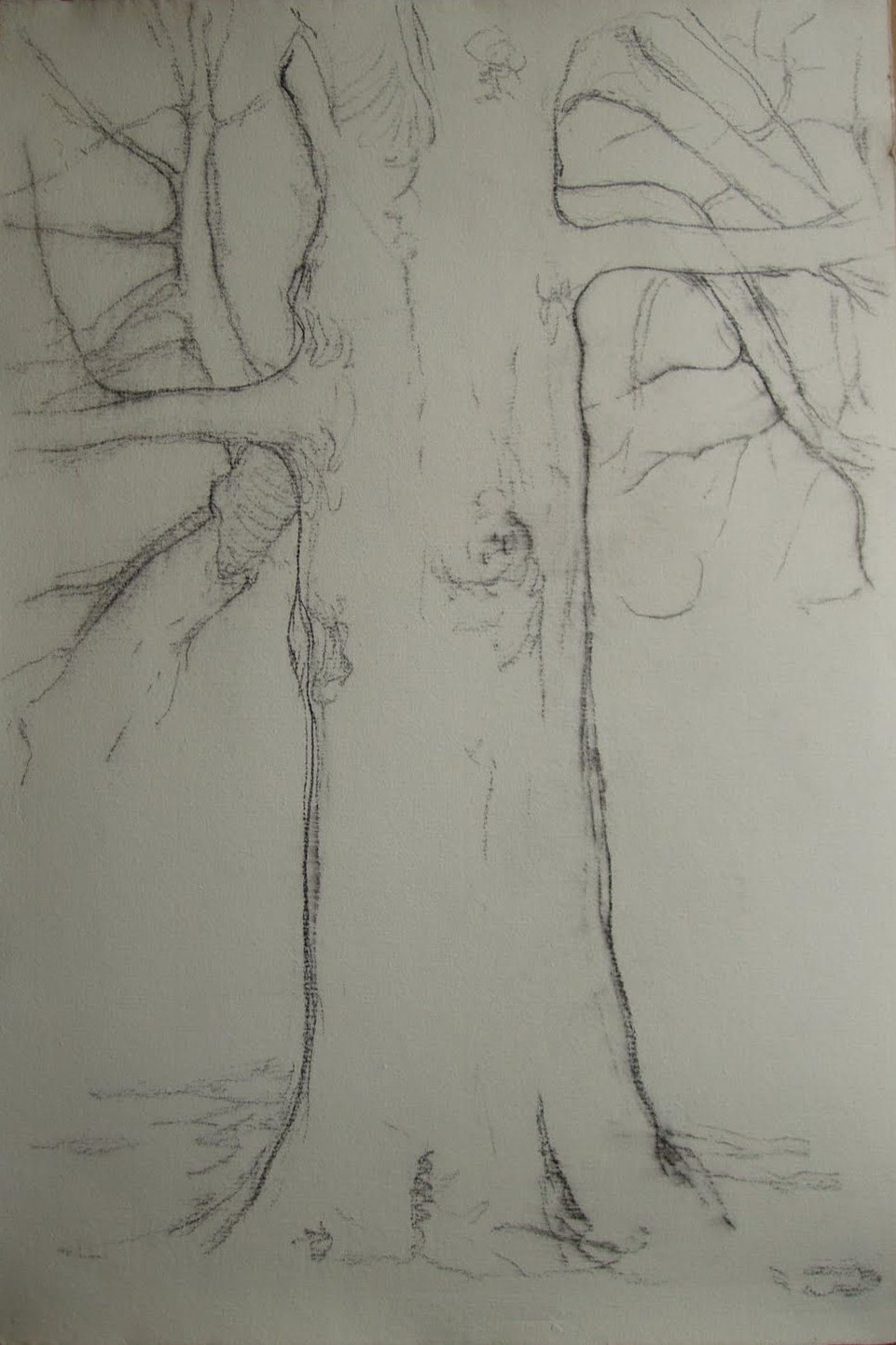
"A tree standing by itself chiefly attracts our attention to the pattern formed throughout its parts. If the foliage is slight, the line of the main stem can be traced from the ground to its dispersal in a haze of twigs at the apex. The balance, the curves, the straight lines that mark its course become our chief concern, and the sparse foliage with its uncompetitive and indefinite forms acts as a foil to display the lines of the stem and its ramifications; we have, in fact, the essential charm that belongs to the winter period. Any single object by its isolation attracts attention." - Rex Vicat Cole, The Artistic Anatomy of Trees, 1915

During winter months bare trees show their structure, their anatomy. Foliage creates shapes and effects of its own but what fascinates me is the bare bones of the thing. Like a skeleton or the underside of a bridge, it's what makes it what it is --- its mass and form. When drawing or painting trees, it is important to understand and represent basic structure. Trunks, branches, and twigs are anatomical elements. When drawing or painting human anatomy, one wants to give arms the right shape, torsos the right proportion. It's not really any different when faced with a tree. The representation of parts --- their size, shape, proportions, and weight, is a matter of repeated study.

It was a cold day last week when I worked on this drawing in Prospect Park. My fingers were hurting but I got a little closer to the right balance of parts than I usually do. But where the trunk terminates at the ground seems flat so I'll have to go find this tree again, if I can. If not, another will do.

Monday, January 25, 2010

perishable things


"I am in despair at the swift flight of time, and the utter impossibility I feel to lay hold upon anything permanent. All my hours and days go to perishable things."
- James Russell Lowell

After struggling the past few months with pretty much everything I've tried to put my hands on, I'm now finished this one measly watercolor study of a skyline in Brooklyn. I like the composition and the color scheme (I changed things a bit from how they appear --- sometimes things look right "live" but all wrong in a painting) but atmosphere and sunlight do very interesting things optically to the edges of forms and I'm afraid I'm having trouble catching that. But this study is successful in terms of composition and the balance between detail and generality. A full sized version is next and I hope to have that finished by the end of February.

Tuesday, December 29, 2009

but the sky is for all


"The noblest scenes of the earth can be seen and known but by few ..... but the sky is for all; bright as it is, it is not 'too bright, nor good for human nature's daily food'; it is fitted in all its functions for the perpetual comfort and exalting of the heart, for the soothing it and purifying it from its dross and dust."
- John Ruskin, Modern Painters, 1843

I've been going through past sketches and studies to see what I can pick up on and develop further. Sometimes these little things will sit around for years and then all of a sudden the time comes where I pick one up and it starts me thinking. These are from 2005. I barely remember doing them (they were in a pile of others) but I must have done them on the spot, outside somewhere, after a rain storm, probably down on the Jersey shore. These little watercolor studies always have an immediacy and reality that I like and want to carry over into my more finished work.

Monday, November 30, 2009

light, shade, and color


"(A)ll nature manifests itself by means of colors to the sense of sight. We now assert, extraordinary as it may in some degree appear, that the eye sees no form, inasmuch as light, shade, and color together constitute that which to our vision distinguishes object from object from each other. From these three, light, shade, and color, we construct the visible world, and thus, at the same time, make painting possible ......"
- Johann Wolfgang von Goethe, The Theory of Color, 1810

This small oil study was done in September in Brooklyn's Prospect Park. It measures 3.25 x 8.75" and is my first done outdoors. Being a study, it is only for visual reference for some other, more complete, painting. Exact detail and perfection are not the aim of studies, rather just an overall impression of shape, color, and value. Like other times when I'm drawing in public, people gathered around to watch. I always dislike that. But they mean no harm and are always friendly.

Tuesday, October 27, 2009

peculiar qualities and possibilities

"Each pair of opposite hues has its peculiar qualities and possibilities. In order to appreciate the characteristic effects of each in nature and in art, it is important to experiment in various ways with a few complimentary pairs until we are quite familiar with the two colors which compose each of them, and with the results of various contrasts and minglings of the colors with each other and with black, white, and gray."
- Walter Sargent, The Enjoyment and Use of Color (1927)


^Still-life Composition (untitled) 2009

I put this watercolor aside after having worked on it for a few hours here and there for about a month. It isn't very big at 13 x 16.5". I wanted the composition simple, almost architectural, and the palette reduced to complimentary colors (whether it's yellow/purple or orange/blue is something I haven't been able to figure out). I am discovering how to keep things simple and under control, while pushing the potential those limits reveal. My efforts here are toward improving my abilities through conscientious work, not slap-dash performance. I therefor am considering every element of what I do with my painting. And the progress is slow --- those damn ellipses tripped me up. I'll have to re-do this one, too.