For Tracy Michele, who always sees them first.
"I wish you to consider that I have been speaking of what I wished to accomplish in these pictures, rather than what I have done; for I may have failed in these efforts. I should, nevertheless, be much gratified if you could see them ...."
- Thomas Cole, letter dated May 1828

Saturday, January 29, 2011

some prattle


"I always make written notations of the colors: the fundamental local color tones, the color-textures, and jot down some ideas for the use of color sequences --- some prattle about my feelings for the scene. "
- John Sloan, The Gist of Art

Sketches and watercolor studies get down pertinent information about a subject in a brief amount of time. They are a type of shorthand --- information collected quickly to be reworked in the studio at a later date. I sometimes write directly on the watercolor paper and paint on it later, as shown above in the third picture. My notes include abbreviations of colors and a number indicating gray scale tone (1 = white, 10 = black). I keep a #5 gray indicator in my sketchbook to gauge things against. Vocalists find their pitch, we painters find our tone.

Scattered among these flannel days of winter have been some tremendous sunsets, the day's death in pretty colors. At first, I hesitated painting these, but I look to Thomas Cole, Caspar David Friedrich, and other idols of mine, for whom intensely colored sunsets were legitimate subjects --- the Sublime, not Margaritaville.

Friday, December 31, 2010

these days


"These days I seem to think a lot
About the things that I forgot to do
And all the times I had the chance to"
- Johnny Darrell, These Days

The end of the year always makes one look back and take a measure of what was accomplaished and what wasn't. 2010 was a mixed year for my work. There were duds and missed deadlines --- Ordinary Objects is still not realized, and the portfolio remains unassembled.

On the other hand, there were positive developments --- the Bullock Online website was established, my Iron Gall Ink is now retailing at Lore (see my previous post), and some of my work this year was solid.

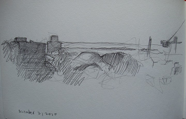
So I sat down and looked out the window again at the landscape view that has occupied much of my time lately and I did one more watercolor. Also, here's a recent sketch of a wider take of the same view, from my sketchbook.

I guess that's how I'll close out the year.

Hoping you all are safe and healthy in 2011.

Happy New Year, everyone.

Friday, December 24, 2010

Bullock's Iron Gall Ink


Bullock's Iron Gall Ink is now available at Lore, in the The New Amsterdam Market HEADQUARTERS at Manhattan's South Street Seaport, 224 Front Street.

This handmade water-soluble ink is based on historic recipes, and includes gall nuts from Aleppo and iron sulfate in a gum arabic base. It is available in 1/2 oz., 1 oz., and 2 oz. bottles.

At Lore, owner Makalé Faber-Cullen's background and education in anthropology informs her selection of products that are based on raw materials and timeless design. From equipment for the kitchen, to sewing supplies from France's last producer of hand-made thread, to Bullock's Iron Gall Ink and Margaret Krug's Indigo Ink, Lore offers a very unique and educational shopping experience for the customer who wants something better than what's available at Bed Bath & Beyond.

You can also reach Lore online at www.lore.is
Lore. tools. ornaments. provisions.

My thanks to Makalé and Margaret for their enthusiasm for Bullock's Iron Gall Ink.

Graphic Design for all Bullock Online packaging is provided by James Rollins Design of Brooklyn, NY. www.creativehotlist.com/jrollins

On a related note, the Bullock Online website is oh so slowly coming along. I just added a page for the ink, and will link to PayPal. All this shouldn't be such trial and error, but the hosting service I use is problematic. Nonetheless, I am learning to navigate the strange ways of their software. I often end up with results I don't want, but I make improvements the next time round.

Now, if I can only find the time to paint.

Merry Christmas, everyone.

Tuesday, November 23, 2010

more greys


"Greys are what might be called 'diminished' colours that are less brilliant than pure colours. Greys, nevertheless, are an essential element in painting since there are in nature more greys than pure colours."
- J.Martin-Barbaz, The Holiday Painter, 1961

After extolling the virtues of the limited palette, I went and added four more colors --- two blues, a chrome oxide green, and sepia. The need to add these became apparent to me as I continued to work on a small scale, and the "next" version of a piece, wherein I develop those initial ideas discovered in the smaller study, weren't getting done. I'm short on time and space and so the little "studies" are becoming an end in themselves. For now.

Chrome oxide green has always been a favorite of mine. The sepia is an historically accurate addition and its transparency is helpful in mixtures. As for the addition of two blues, ultramarine and cerulean, when I already have prussian, I'll just say that the various grays they provide are important. By mixing only with sepia, for example, I have three different cool grays. The results are shown above.

Saturday, October 30, 2010

a thousand different aspects


"To many people a place is merely a place. It may be viewed under a thousand different aspects, but it is seen only as the same place. And yet, if we inquire into the psychology ...... we find, not an inherent sense of realism, but a quintessential sense of symbolism." - J.Hullah Brown, Water Colour Guidance

For reasons that at first were not apparent, the view from the Brooklyn Heights apartment, facing south-west (more or less), really interests me. Throughout the day there is a dramatic range of color, illumination, and shadow, all played out upon groupings of architectural forms, masses of trees, and distant points, which is really kind of fascinating to watch. The hills over in Jersey are sharp-edged and solid sometimes, misty and ethereal other times. The buildings, with just a little imagining, could be Roman ruins. But why imagine? It's all really splendid as it is.

I want to keep working on this same view, seeing how it gives me so much to work with. It changes all day long, so there's always something new going on. And I don't have to go somewhere to do it. It's right outside the window. And the tea pot is only a few feet away.

Tuesday, September 28, 2010

'accuracy' is relative


"But the accuracy of artists working as artists is the expression of feeling with precision. For them, 'accuracy' is relative, and 'realism' is only a wish to be objective, because there can be no general agreement in the arts as to what is real: each artist has a different way of explaining it."
- Lynton Lamb, Preparation For Painting

This is as close as I've come to identifying with abstract concerns. But it becomes obvious to any working artist --- painter, sculptor, whatever you like --- that even representational art is a form of abstraction unless we enslave our talents to pure surface copying. The simple act of interpretation into paint is a step into the abstract. This watercolor was done recently of a view out of Tracy's window overlooking the BQE with Red Hook to the southwest. Eliminating the smaller elements in the scene, I got down the larger, most important elements to create a balance without oversimplifying.

Tuesday, August 24, 2010

Bullock Online Website Update

The link to the right will take you to my website, Bullock Online, which is up and running again. This is an ongoing project, but I expect the general layout will be completed by October, with a full-service sales feature so my work is available for purchase. In the meantime, this blog is still the best place to see my work.

The web site's host and their design-your-own-website software has been less than inspiring, I'm afraid, but I am looking at alternatives and am confident that something great will work out soon. The ability to design one's own website without knowing HTML code is quickly becoming a commonplace feature, and offers increasingly sophisticated results. In the meantime, there are a few frustrations that I am just stomping my way through. No direction to go but forward, right?

In A Shot In the Dark, after falling into a water fountain, Detective Clouseau says, "Ah, it is all part of life's rich pageant." That's how this all feels sometimes.